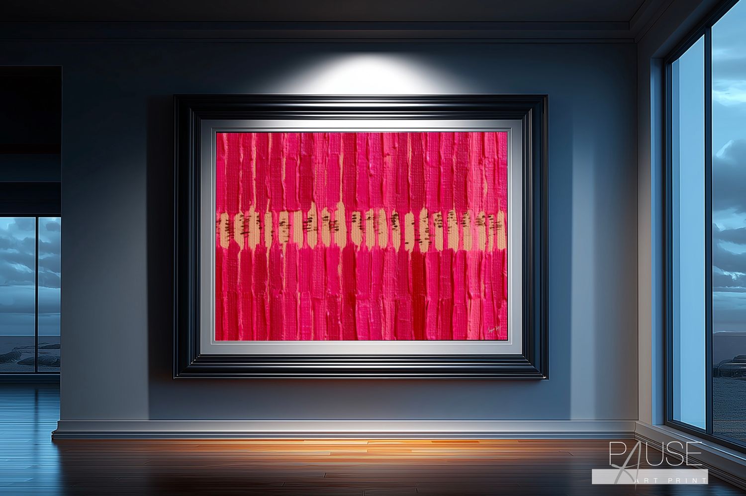
Pause. A Daily Practice. Original Art Canvas Print
SKU C-ABSTPSE001
R1 699.00
Canvas Size
Frame Thickness
Please choose
The one thing every day needs. Every single day.
1
Save this product for later
Have questions?
Pause. A Daily Practice. Original Art Canvas Print
Product Details
The Work
Vertical strokes of crimson red and hot pink move from top to bottom in rhythmic bands, rendered in thick impasto technique that leaves visible ridges and physical depth across the surface. The paint sits heavy, directional, and purposeful. Red is the base colour here. Pink is achieved by lightening that same red with white, keeping both tones in the same spectrum and giving the composition a natural visual harmony rather than a contrast. Running horizontally through the centre, a band of warm sandy ochre interrupts the vertical movement, creating a visual breath between the upper and lower fields. Within that ochre band, a row of small dark brown marks punctuates the space at regular intervals, like quiet stitches sewn into the pause itself. Above and below, the red and pink resume. The pattern repeats. So does life.
The Inspiration
This piece is rooted in the way human beings move through their days. Morning has its rhythm. Evening has its own. And between them, somewhere in the middle, there is almost always a moment that slips by unclaimed. "Pause. A Daily Practice." was created to name that moment and to ask you to protect it. The dark marks in the ochre band are not decorative. They are a reminder, set into the piece like a daily alarm, that this practice belongs to you and you alone.
What It Carries
"Pause" is not about rest in the traditional sense. It carries whatever the viewer brings to it. For some, it is a moment of stillness. For others, it is prayer, affirmation, breathwork, or simply five minutes of silence. The piece does not prescribe. It only insists. That quiet horizontal line holds the space between the busyness above and the busyness below, and it does so with a kind of gentle authority that is hard to ignore over time.
Living With It
Crimson red and hot pink are vivid and direct without being aggressive in a well-lit space. Both sit in the same colour spectrum, which gives the piece a confident coherence rather than visual tension. This works beautifully against white, cream, charcoal, warm grey, dark green, or deep navy walls. It belongs in a home office as a daily visual prompt, in a bedroom as an intention-setter, or in a meditation or wellness space as a focal point. In a commercial setting such as a therapy practice, wellness studio, or executive lounge, it communicates purpose without a single word on the wall. Larger formats in A0 give the ochre pause band the physical presence it deserves.
Who It's For
This one is for the person who already knows they need to slow down but hasn't built the structure to do it yet. It is also for the person who has, and wants the art on their wall to honour that commitment.
A Note on Sizes
This design is available in a range of sizes to suit your space. Available as A0 and A1 poster prints, rolled and shipped. Also available as mounted canvas prints in 16mm, 25mm, 35mm, and 50mm profile thicknesses in both A0 and A1. A large format 1200 x 2000mm option is available on both poster and mounted canvas. Email jacques@jacquesviljoen.co.za for a quote and full details. Please note that proportions shown in previews are for display purposes only. Your final print dimensions will depend on the size you select.
You May Also Like

Display prices in:ZAR